Year
2025
Category
Visual Identity
Product Duration
3 - 4 Weeks
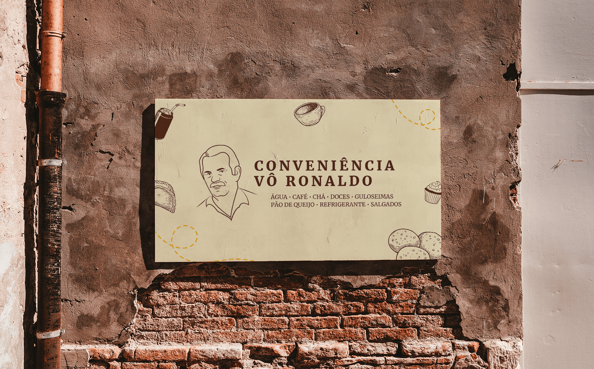
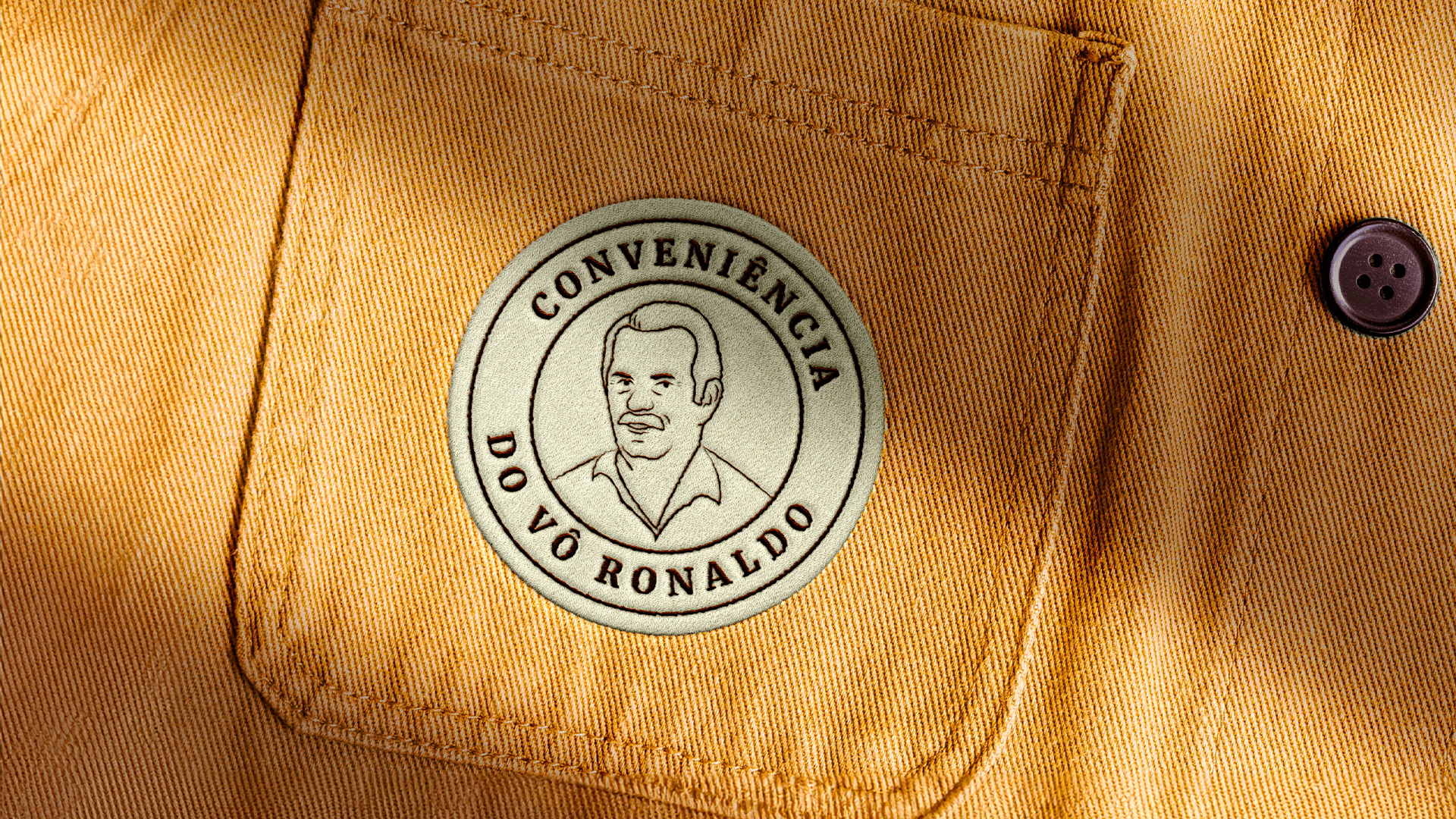
The project started with an exploration of local convenience stores and the nostalgic memories they evoke. The research focused on understanding the spirit of small family-run businesses, their visual codes, and the sense of community they represent. Observing vintage signage, informal communication, and vibrant aesthetics played a key role in defining the direction.
The design process brought this idea to life through:
A playful and bold logo inspired by vintage Brazilian signage.
A warm and colorful palette that feels both nostalgic and lively.
Hand-drawn illustrations and graphic elements that reflect informality and friendliness.
Layouts and visual compositions that balance simplicity with character.

The identity was applied across key deliverables such as:
Packaging, menu boards, storefront signage, and social media assets.
A flexible brand system that allows for spontaneous and creative communication, just like a real convenience store does.
Digital mockups and physical applications that capture the spirit of the brand while ensuring visual consistency.

Every project within the portfolio tells a unique story, from the design process to the final ride. The layout focuses on showcasing the craftsmanship, detailing, and innovation behind each bike, offering a powerful visual experience for riders, builders, and enthusiasts alike. It's not just a portfolio; it's a tribute to the passion, creativity, and adventure that come with every ride.